
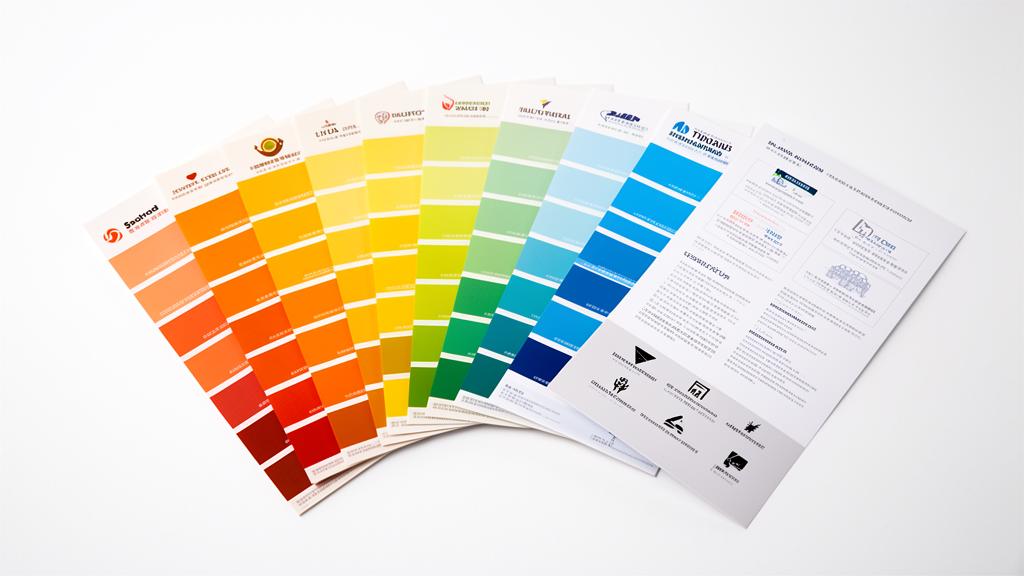
Color is the fastest shortcut to emotion. Research published in Management Decision found that up to 90% of snap judgments about products can be based on color alone. That's an extraordinary amount of influence from a single design choice.
Yet most founders choose brand colors based on personal preference rather than strategic intent. This guide changes that—showing you how to select colors that align with your brand positioning and actually drive conversions.
The Psychology of Individual Colors
Red: Energy, Urgency, Passion
Associations: Excitement, power, danger, appetite, love, urgency
Conversion power: Creates urgency—widely used for CTAs and sale promotions
Brand examples: Coca-Cola, Netflix, YouTube, Nintendo, Target
Best for: Food & beverage, entertainment, sports, sales-driven brands
Avoid for: Finance, healthcare, luxury (can feel aggressive)
Blue: Trust, Stability, Professionalism
Associations: Reliability, calm, intelligence, security, technology
Conversion power: Builds trust—the most popular color in corporate branding
Brand examples: Facebook, IBM, Samsung, PayPal, LinkedIn, Salesforce
Best for: Technology, finance, healthcare, B2B, professional services
Note: Blue is extremely popular—you may need to differentiate with shade or pairing
Green: Growth, Health, Nature
Associations: Nature, wealth, freshness, sustainability, health
Conversion power: Signals eco-friendliness and wellness
Brand examples: Starbucks, Spotify, Whole Foods, John Deere, Robinhood
Best for: Health & wellness, finance, sustainability, food, outdoor brands
Avoid for: Luxury (can feel too casual)
Yellow: Optimism, Warmth, Attention
Associations: Happiness, energy, caution, creativity, youth
Conversion power: Grabs attention—excellent for accents and highlights
Brand examples: McDonald's, Snapchat, IKEA, National Geographic
Best for: Children's brands, food, creative industries, budget-friendly brands
Caution: Overuse causes eye fatigue; best as accent color
Purple: Luxury, Creativity, Wisdom
Associations: Royalty, imagination, spirituality, sophistication
Conversion power: Signals premium quality and creative thinking
Brand examples: Cadbury, Hallmark, Yahoo, Twitch, FedEx (accent)
Best for: Luxury brands, creative services, beauty, SaaS, education
Note: Light purple (lavender) feels calming; dark purple feels regal
Orange: Confidence, Friendliness, Fun
Associations: Energy, adventure, enthusiasm, warmth, affordability
Conversion power: Strong for CTAs—stands out without red's aggression
Brand examples: Amazon, Harley-Davidson, Nickelodeon, Fanta, HubSpot
Best for: E-commerce, entertainment, youth brands, tech startups
Avoid for: Luxury, formal professional services
Black: Sophistication, Power, Elegance
Associations: Luxury, authority, exclusivity, modernity, timelessness
Conversion power: Creates premium perception and contrast
Brand examples: Apple, Nike, Chanel, Uber, Adidas
Best for: Luxury, fashion, technology, automotive
Note: Works best with generous white space
White: Simplicity, Cleanliness, Modern
Associations: Purity, space, minimalism, possibility
Conversion power: Creates breathing room that increases comprehension
Brand examples: Apple (secondary), Google, Tesla
Best for: Technology, healthcare, minimalist brands
Note: White is almost always a supporting color, not a primary brand color
Building Your Brand Color Palette
Step 1: Start With Strategy, Not Preference
Your favorite color is irrelevant. What matters is:
- What emotions should your brand evoke?
- What do your competitors use? (Differentiate or align intentionally)
- What does your target audience respond to?
Step 2: Choose Your Primary Color
This is your signature color—the one people will associate with your brand. Choose based on the psychology above AND competitive differentiation.
Pro tip: If every competitor uses blue, choosing orange or green instantly sets you apart.
Step 3: Select Secondary Colors
2-3 supporting colors that complement your primary:
- Complementary (opposite on color wheel) for maximum contrast
- Analogous (adjacent on color wheel) for harmony
- Triadic (evenly spaced) for vibrant variety
Step 4: Define Neutral Colors
Every brand needs neutrals for backgrounds, text, and UI:
- Pure white (#FFFFFF) or warm white
- Near-black for text (not pure black—try #1A1A1A)
- 2-3 gray tones for supporting elements
Step 5: Pick an Accent Color
A bright, attention-grabbing color for:
- Call-to-action buttons
- Important notifications
- Highlight elements
Your accent color should contrast strongly with your primary color.
Color and Conversions: What the Data Says
- Red CTAs outperform green CTAs by 21% in some A/B tests (HubSpot)
- Brand color increases recognition by 80% (University of Loyola study)
- 93% of consumers place visual appearance above other factors when shopping
- Consistent brand color usage increases revenue by up to 23%
Using AI for Color Selection
AI branding tools like BrandScoop generate complete, harmonious color palettes based on your business description and industry. This removes the guesswork and applies color theory automatically.
The palette includes:
- Primary and secondary brand colors
- Complementary accent colors
- Light and dark mode compatible
- Exact HEX, RGB, and HSL values
This is especially valuable for non-designers who may struggle to build harmonious palettes from scratch.
Quick Action Steps
- Audit your current colors against the psychology guide above
- Check competitor colors — are you differentiating or blending in?
- Generate a professional palette with BrandScoop →
- Apply consistently across every touchpoint
Color is too powerful to leave to chance. Make it strategic.