Your brand identity is more than a logo. It's the complete visual system that shapes how customers perceive, remember, and connect with your business. A strong brand identity builds trust, creates recognition, and ultimately drives revenue.
Yet most founders approach brand identity backwards—starting with a logo and hoping everything else falls into place. This guide walks you through the strategic, systematic approach that professional brand designers use, adapted for founders and non-designers.
What Is Brand Identity (And What It Isn't)
Let's clarify terminology that's often confused:
- Brand: The overall perception people have of your business—your reputation, values, and promise
- Brand Identity: The visual and tangible elements that represent your brand (logo, colors, typography, imagery)
- Brand Strategy: The plan for how you want to be perceived and how you'll get there
- Branding: The process of creating and managing all of the above
Brand identity is the visual expression of your brand strategy. It's what people see, and it needs to accurately communicate who you are and what you stand for.
According to Lucidpress research, consistent brand presentation across all platforms increases revenue by up to 23%. That's the power of a well-executed brand identity.
The 7 Elements of Brand Identity
A complete brand identity system includes these core components:
1. Logo
Your logo is the cornerstone—the most visible element of your identity. It needs to work across every application, from a tiny favicon to a billboard.
Key requirements:
- Works at any size (scalable vector format)
- Effective in color, black & white, and reversed
- Simple enough to be memorable
- Distinct from competitors
- Appropriate for your industry
For an in-depth guide to logo creation, see our AI Logo Maker Complete Guide.
2. Color Palette
Color is the fastest way to create emotional associations. Your palette should include:
- Primary color: Your main brand color (1-2 colors)
- Secondary colors: Supporting colors for variety (2-3 colors)
- Neutral colors: Backgrounds, text, and UI elements
- Accent color: For calls-to-action and highlights
Each color should have defined values for digital (HEX, RGB) and print (CMYK, Pantone).
For the science behind color selection, read Brand Color Psychology: How to Choose Colors That Convert.
3. Typography
Your typeface choices communicate as much as your words. A brand typography system includes:
- Primary/Display typeface: For headlines and prominent text
- Secondary/Body typeface: For paragraphs and general content
- Accent typeface (optional): For special elements like quotes or callouts
Typography rules of thumb:
- Limit to 2-3 typefaces maximum
- Ensure web compatibility (Google Fonts or Adobe Fonts)
- Test readability at various sizes
- Define hierarchy (H1, H2, H3, body, caption sizes)
4. Imagery Style
How photographs, illustrations, and graphics look across your brand:
- Photography style: Bright and airy? Dark and moody? Candid or staged?
- Illustration style: Flat? 3D? Hand-drawn? Geometric?
- Icon style: Outlined? Filled? Rounded? Sharp?
Consistency in imagery style is what separates amateur brands from professional ones.
5. Voice and Tone
While not purely visual, voice and tone affect how visual elements are used:
- Formal or casual? This influences design choices (serif vs sans-serif, structured vs playful layouts)
- Technical or accessible? Affects complexity of visual communication
- Authoritative or friendly? Guides color and typography decisions
6. Layout and Composition
How elements are arranged across your touchpoints:
- Grid systems for consistency
- Spacing and white space guidelines
- Logo placement rules (clear space, minimum sizes)
- Content hierarchy patterns
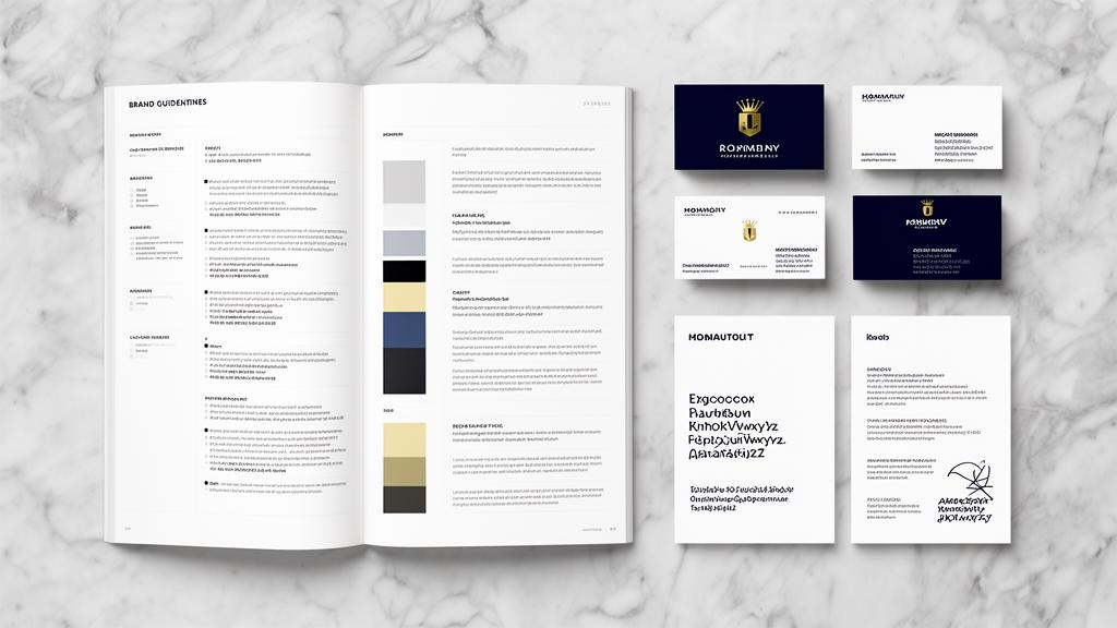
7. Brand Guidelines Document
The document that codifies all of the above into a reference that anyone can follow. This ensures consistency whether you're designing yourself, working with freelancers, or scaling a team.
Building Your Brand Identity: The Process
Phase 1: Strategy (Before Any Design)
Skip this phase and everything that follows will be misaligned.
Define your brand positioning:
- Who are you for? (Target audience)
- What do you do? (Value proposition)
- Why should they care? (Differentiator)
- How do you want to be perceived? (Brand personality)
Research your competitive landscape:
- Collect 10-15 competitor brand identities
- Identify visual patterns in your industry
- Find opportunities to differentiate
- Note what you admire and what to avoid
Create a mood board:
- Gather 20-30 images that represent your desired brand feeling
- Include colors, textures, typography examples, and photography styles
- This becomes your visual north star
Phase 2: Core Identity Creation
With strategy defined, create your core elements:
Logo development:
Use an AI logo maker like BrandScoop to generate professional options quickly, or work with a designer for custom work. Either way, ensure you have:
- Primary logo (full color)
- Reversed/white version
- Icon-only version
- Horizontal and stacked variations
Color palette selection:
- Start with your primary brand color based on emotional associations
- Build complementary secondary and neutral colors
- Test accessibility (WCAG contrast ratios)
- Define exact color values for all formats
Typography selection:
- Choose a display font that matches your personality
- Pair it with a readable body font
- Define the complete type scale (sizes, weights, line heights)
Phase 3: System Extension
Extend your core identity into a complete system:
- Business cards and stationery
- Social media templates (profile images, cover photos, post templates)
- Email signatures
- Website design (applying your identity to digital)
- Presentation templates
- Marketing collateral (flyers, brochures, ads)
Phase 4: Documentation
Create brand guidelines that include:
- Logo usage rules (dos and don'ts)
- Color specifications (all formats)
- Typography rules and hierarchy
- Imagery guidelines
- Voice and tone examples
- Template access
BrandScoop generates brand guidelines automatically as part of the brand creation process, giving you a professional PDF you can share immediately with your team and contractors.
Brand Identity for Different Business Types
SaaS and Tech Startups
Common characteristics:
- Clean, minimal aesthetics
- Blue, purple, or green primary colors (trust and innovation)
- Sans-serif typography
- Geometric iconography
- Emphasis on digital-first applications
Key touchpoints: Website, app UI, email, documentation, social media
For naming guidance specific to SaaS, see SaaS Company Name Ideas.
E-commerce and DTC Brands
Common characteristics:
- Product photography integration
- Packaging-first design thinking
- Instagram-ready aesthetics
- Lifestyle imagery
- Unboxing experience consideration
Key touchpoints: Packaging, website, Instagram, email, ads
Professional Services
Common characteristics:
- Conservative, trustworthy aesthetics
- Serif or classic sans-serif typography
- Navy, gray, dark green color palettes
- Photography featuring people
- Credential and trust signal emphasis
Key touchpoints: Business cards, proposals, website, LinkedIn
Creative Industries
Common characteristics:
- Bold, distinctive visual choices
- Experimental typography
- Vibrant or unexpected color palettes
- Portfolio-centric design
- The brand IS the proof of capability
Key touchpoints: Portfolio website, social media, case studies
DIY vs Professional vs AI: Choosing Your Path
| Approach | Cost | Timeline | Quality | Best For |
|---|---|---|---|---|
| DIY (Canva, etc.) | Free-$13/mo | Hours | Basic | Side projects, MVPs |
| AI Platform (BrandScoop) | $15-29 | Minutes | Professional | Startups, SMBs, speed-focused founders |
| Freelance Designer | $500-5,000 | 2-4 weeks | Good-Excellent | Established businesses with specific vision |
| Branding Agency | $5,000-50,000+ | 4-12 weeks | Excellent | Funded startups, enterprises, rebrands |
For most founders, the optimal path is:
- Launch with AI-generated branding (get to market fast)
- Iterate based on customer feedback (learn what resonates)
- Invest in professional design when the business can justify it
This matches the lean startup philosophy—validate first, polish later. For more on this approach, read Why Execution Beats Perfect Branding.
Brand Identity Mistakes That Kill Startups
Mistake 1: Inconsistency
Using different colors, fonts, and logo variations across touchpoints confuses customers and erodes trust. One study found that inconsistent branding can decrease customer confidence by up to 40%.
Fix: Create guidelines and follow them religiously. Tools like BrandScoop include brand guidelines with every brand package.
Mistake 2: Copying Competitors
Your brand identity should differentiate, not assimilate. If you look like everyone else in your category, you become invisible.
Fix: Research competitors but explicitly make choices that stand apart. If everyone uses blue, consider a warm color. If everyone is minimal, consider being bold.
Mistake 3: Designing for Yourself Instead of Your Audience
Your personal aesthetic preferences are irrelevant. What matters is what resonates with your target customers.
Fix: Always evaluate brand identity decisions through the lens of your target audience. What builds trust with THEM?
Mistake 4: Over-Designing
Complex brand systems are hard to maintain and implement consistently. The best brand identities are surprisingly simple at their core.
Fix: Start with the minimum viable brand identity (logo, 3-5 colors, 2 fonts) and expand only as needed.
Mistake 5: Never Updating
Brands evolve. A startup identity that worked at launch may not work at scale. Plan for evolution.
Fix: Review your brand identity annually. Small refinements keep you current without losing recognition.
Your Brand Identity Action Plan
This Week:
- Complete brand positioning (30 minutes) — Define your audience, value proposition, and personality
- Research competitors (1 hour) — Screenshot 10+ competitor brand identities
- Create a mood board (30 minutes) — Collect images that represent your desired brand feeling
This Month:
- Generate your brand identity — Use BrandScoop to create your name, logo, colors, and guidelines in one session
- Apply to primary touchpoints — Website, social media profiles, email signature
- Share guidelines with your team — Ensure consistency from day one
This Quarter:
- Audit consistency — Review all touchpoints against your guidelines
- Gather feedback — Ask customers what they think of your brand
- Iterate — Make small refinements based on real-world performance