
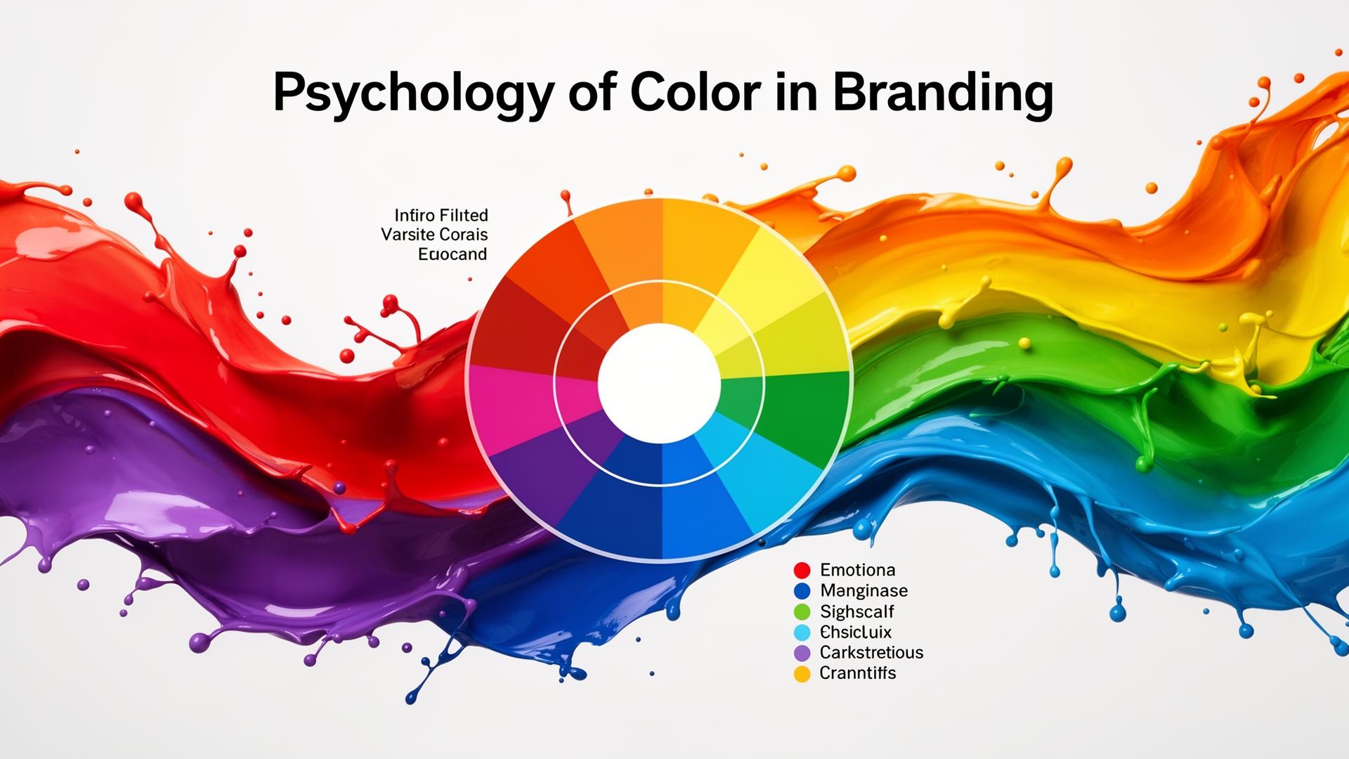
Color is one of the most powerful tools in branding. According to research published in the Journal of the Academy of Marketing Science, color can influence perception, trigger emotions, and drive behavior—all within milliseconds.
Studies from the Institute for Color Research show that people make a subconscious judgment about a product within 90 seconds of initial viewing, and up to 90% of that assessment is based on color alone.
How Colors Affect Perception
Red
Associations: Energy, passion, urgency, excitement
Best for: Food, entertainment, sales, youth brands
Examples: Coca-Cola, Netflix, YouTube
Science: Research in the journal Emotion shows red increases heart rate and stimulates appetite.
Blue
Associations: Trust, stability, professionalism, calm
Best for: Finance, technology, healthcare, corporate
Examples: Facebook, IBM, PayPal
Science: Color psychology studies link blue to reduced anxiety and increased productivity.
Green
Associations: Nature, health, growth, sustainability
Best for: Environment, wellness, organic products
Examples: Whole Foods, Spotify, Animal Planet
Science: Green is easiest for the eye to process, creating a calming effect.
Yellow
Associations: Optimism, warmth, creativity, attention
Best for: Children's products, food, leisure
Examples: McDonald's, Snapchat, IKEA
Science: Yellow stimulates mental activity and generates muscle energy.
Purple
Associations: Luxury, creativity, wisdom, royalty
Best for: Beauty, premium products, creative services
Examples: Cadbury, Hallmark, Twitch
Science: Purple combines the energy of red with the calm of blue.
Orange
Associations: Friendliness, confidence, adventure
Best for: Entertainment, food, youth brands
Examples: Nickelodeon, Fanta, Amazon
Science: Orange creates enthusiasm and encourages action.
Black
Associations: Sophistication, luxury, power, elegance
Best for: Luxury goods, fashion, technology
Examples: Chanel, Nike, Apple
Science: Black provides powerful contrast and conveys authority.
Choosing Your Brand Colors
According to Pantone's Color Institute, follow these principles:
- Understand your audience - Demographic research shows different age groups and cultures respond differently to colors
- Consider your industry - Some colors are expected; others help you stand out
- Think about context - How will colors appear across different media?
- Test with real users - Get feedback from your target audience
- Ensure accessibility - Use WebAIM's Contrast Checker to verify readability
Building a Color Palette
A typical brand palette includes:
- Primary color - Your main brand color (the one people associate with you)
- Secondary color - Complements the primary (often analogous or complementary)
- Accent color - For calls-to-action and highlights
- Neutral colors - For backgrounds and text
Adobe Color and Coolors are excellent tools for building harmonious palettes.
Conclusion
Color choices should be intentional, not arbitrary. When you understand the psychology behind color, you can make strategic decisions that strengthen your brand's message and connection with your audience.
Ready to build your color palette? Create your brand with BrandScoop and get AI-generated color recommendations that match your brand personality.
*Related reading: Why Brand Identity Matters for Startups — Color is just one piece of your brand puzzle.*
*Also explore: Logo Design Trends to Watch in 2025 — See how color trends are evolving.*